
🟩 Multi Input
🟩 Multi Input
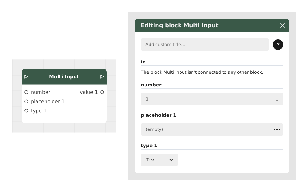
The Multi Input block shows several input fields at once, in a single form, instead of asking for one piece of information after another.
It's handy for a sign-up, creating a profile, or a fairly detailed questionnaire: the user fills everything in one go, in an interface that adapts to their device (desktop or mobile).
📥 Inputs
- count (Number): The number of input fields to display. Default value: 1.
- For each field (how many depends on the value above) — the inputs are first named « placeholder 1 », « type 1 », « placeholder 2 »… and the outputs « value 1 », « value 2 »…, then take the name of the placeholder you type:
- placeholder (Text): The example text shown in that field (e.g. "Name", "Email"). This text is also used to name the matching output.
- type (Dropdown list): The kind of information expected for that field: Text, Number or Boolean (a true/false checkbox).
📤 Outputs
- out (Stream): Fires once the user has confirmed the form, so the scenario can continue.
- one output per field (Text, Number or Boolean depending on the chosen type): Holds the value entered in that field. This output's name automatically matches the placeholder set for that field (e.g. an "Email" output if that field's placeholder was "Email").
💡 Example of use
Scenario: Registering for an online service
- Your application needs to collect a new user's name, email and age.
- Instead of creating 3 separate input blocks, configure the Multi Input block with count = 3, then give each field its placeholder ("Name", "Email", "Age") and its type (Text, Text, Number).
- The user is presented with a single form with the 3 fields, styled according to the application's theme.
- After validation, each field directly produces its own output ("Name", "Email", "Age"), already in the right format, ready to use elsewhere in the graph.
- The scenario continues from the out output, for example to create the user account.
⚙️ Technical Details
- Ease of use: Grouping several fields into a single form saves the user a tedious succession of screens, and improves the experience.
- Personalization: The form's appearance follows the application's visual theme.
- Field types: The chosen type (Text, Number, Boolean) determines the input format shown to the user for that field, and the type of the value it returns.
Documented version: v1
Updated on: 23/09/2026
Thank you!