
🟪 Clickable zone
🟪 Clickable zone
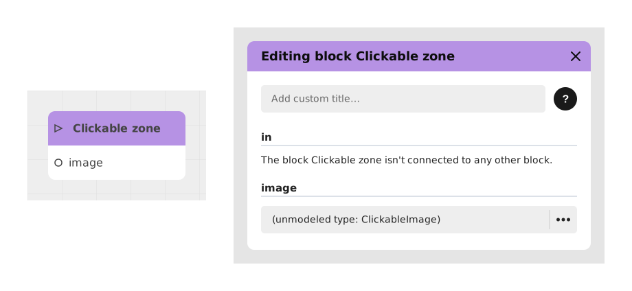
The Clickable zone block turns a picture into several invisible buttons: you mark out areas on an image (for example "Play", "Options" and "Quit" buttons drawn on a background) and each area becomes clickable for the player. It is ideal for a custom illustrated menu, or for a "Point and Click" style game where players must find and click hidden objects in a scene.
There is nothing to code: as soon as you add a zone to the image, the block automatically creates the matching output in the graph.
📥 Entries
- in (Flow): Entry point triggering the display of the clickable image.
- image (Clickable Image): Resource containing the interactive zones (layers or sub-zones) previously defined.
- Dynamic zones (Parameters): Additional entries automatically generated for each interactive zone, allowing its behavior or style to be modified before display.
📤 Outings
- [Zone 1 name], [Zone 2 name], ... (Stream): Dynamic outputs created for each interactive area of the image. Clicking on an area activates the corresponding output.
💡 Example of use
Scenario: Custom home menu with visual buttons
- You have prepared a Clickable Image resource representing a home screen with three buttons: "Play", "Options" and "Exit".
- In the graph, add a Clickable area block and connect it to a trigger (eg: module loading).
- Assign your image to the image entry in the block.
- The block now displays three outputs: "Play", "Options" and "Exit".
- Connect the "Play" output to a game launch block, "Options" to a configuration menu, and "Exit" to an exit confirmation.
⚙️ Technical Details
- Dynamic output management: The block analyzes the image to automatically generate the outputs corresponding to the interactive areas.
- Compatibility: Supports TextWithImage type layers for text extraction (useful for translation).
- Optimization: Dynamic inputs allow real-time adjustments without changing the image resource.
Documented version: v1
Updated on: 23/09/2026
Thank you!