
🟩 Input
🟩 Input
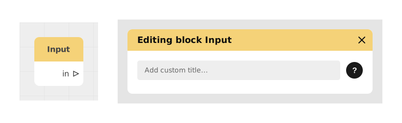
The Input block shows a small field where the user can type in a piece of information, directly inside the Celestory interface, without opening a separate window. This avoids breaking immersion with a system window popping up abruptly.
It's a lighter, more natural alternative to a classic input window: the field blends into the scene (for example inside a chatbot-style conversation, or at the bottom of the screen).
This block only captures one piece of information at a time (for example just an email, or just an age). If you need to collect several pieces of information at once (name, email and password, for example), use the Multi Input block instead.
📥 Inputs
- type (Dropdown list): The kind of information expected: text (default), password, number or email. This also changes the keyboard or format shown to the user.
- placeholder (Text): Example text shown in the empty field to guide the user (e.g. "Enter your email address").
📤 Outputs
- out (Stream): Fires once the user has confirmed their entry, so the scenario can continue.
- text / number / email / password (Text or Number): Output whose name automatically changes to match the type chosen above (e.g. it will be called "email" if the type is email). It holds the value typed by the user: as Text for text/email/password, as Number if the type is number.
💡 Example of use
Scenario: Email collection at the end of an interactive quiz
- The user completes a fun quiz on culinary preferences.
- The Input block appears with the type set to "email" and the placeholder: "Enter your email to receive your personalized results."
- The field stays visible without hiding the conversation history, and automatically adapts to the screen (mobile keyboard, small screen size, etc.).
- Once confirmed, the email output holds the entered address: it can be sent on to an external service (via a Make/Zapier integration).
- The scenario continues from the out output to display a thank-you message and send the results by email.
⚙️ Technical Details
- Screen handling: The block automatically adjusts the visible area so it isn't hidden by the mobile keyboard or other interface elements.
- Compatibility: Works the same way on desktop and mobile, without relying on the operating system's native windows.
Documented version: v1
Updated on: 23/09/2026
Thank you!