
Updated for version 6.0.30
The screen ratio is the shape of the screen: taller than wide, square, or wider than tall. In Celestory, each ratio is picked from a list where it has a small icon drawn in its shape, a name (for example Portrait 9:16 or Panoramic landscape 21:9) and a line on what it is used for. This article explains where to find this list, what each format means, and the difference between the project ratio and the ratios that are only used for previewing.
Two kinds of ratios
| Setting | Where | What it changes |
|---|---|---|
| Project ratio | Project settings window, and Display tab of the Debug window | How your app adapts to the screen: Portrait, Landscape or Responsive |
| Preview screen ratio | Display tab of the Debug window, and preview of the Project menus window | Only the shape of the preview, to see your content on another screen. Your app's ratio does not change |
Both lists work the same way: click the button (it shows the icon and name of the current ratio), then click a ratio. The chosen one is ticked. With the keyboard, the up and down arrows move through the list and Escape closes it.
Choosing the project ratio
- Click the blue button at the top left (your project's menu), then Project. The Project settings window opens.
- Under Project ratio, open the list and choose Portrait, Landscape or Responsive.
- Click Save.
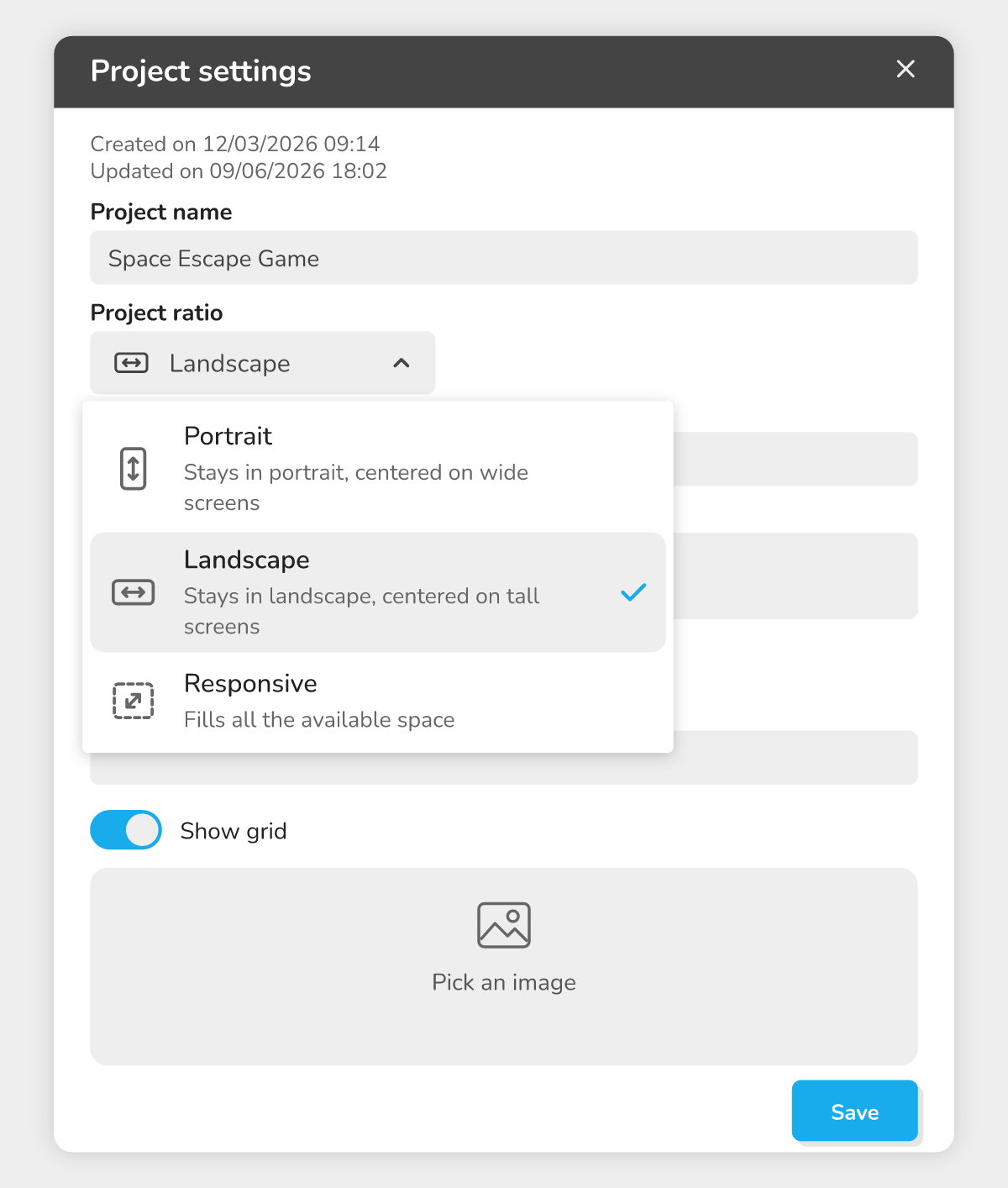 The "Project ratio" list: three choices, each with an icon and a description.
| Project ratio | What it does |
|---|---|
| Portrait | Stays in portrait, centered on wide screens |
| Landscape | Stays in landscape, centered on tall screens |
| Responsive | Fills all the available space |
The icons are a reminder: the arrow of Portrait is vertical, that of Landscape is horizontal, and the dashed frame of Responsive shows that the content stretches in every direction.
The same choice is in the Display tab of the Debug window, under Project ratio: it also changes the project ratio, not only the preview.
Previewing your app on another screen
While testing, you can simulate another screen without touching the project ratio.
- Click Play current module. The Play test and Debug windows open.
- In the Debug window, click the Display tab.
- Under Preview screen ratio, choose a format.
- Click Resize: the Play test window takes the chosen shape.
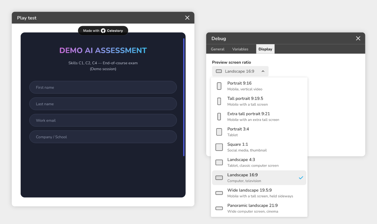 The Display tab of the Debug window: each format has an icon in its shape, a name and a use.
Here are the formats offered, in the order of the list:
| Format | For which screen |
|---|---|
| Portrait 9:16 | Mobile, vertical video |
| Tall portrait 9:19.5 | Mobile with a tall screen |
| Extra tall portrait 9:21 | Mobile with an extra tall screen |
| Portrait 3:4 | Tablet |
| Square 1:1 | Social media, thumbnail |
| Landscape 4:3 | Tablet, classic computer screen |
| Landscape 16:9 | Computer, television |
| Wide landscape 19.5:9 | Mobile with a tall screen, held sideways |
| Panoramic landscape 21:9 | Wide computer screen, cinema |
The first number is the width, the second the height: 9:16 is therefore taller than wide, 16:9 wider than tall.
Previewing a menu at different ratios
The Project menus window (blue button, then Menus) shows a preview of the selected menu. Above this preview, the same list of formats lets you see the menu on a phone, tablet or computer screen. This choice is only for the preview: it changes neither the menu nor the project ratio.
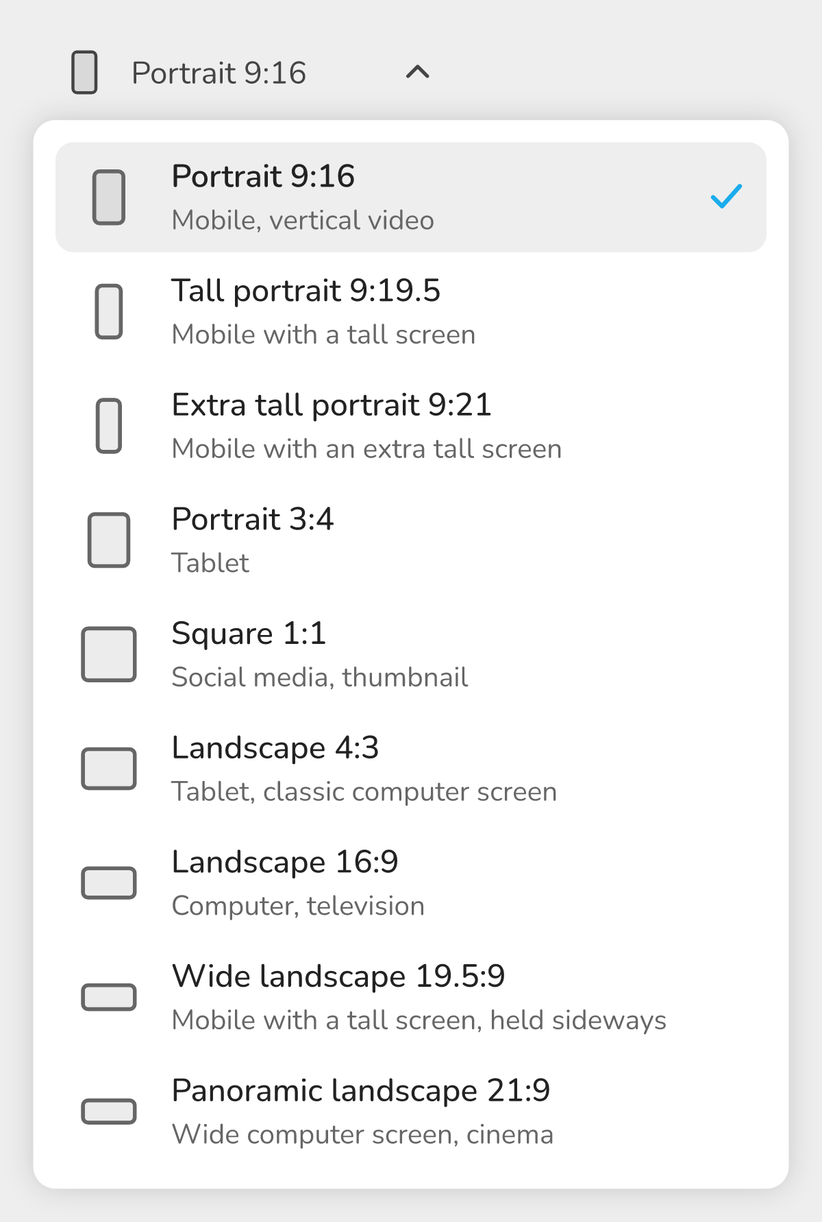 The list of formats above the preview of a menu.
Example: a quiz designed for phones
You are creating a quiz that your students will mostly take on their phones.
- In Project settings, choose Portrait, then Save.
- Start Play current module, Display tab of Debug: choose Tall portrait 9:19.5, then Resize, to check that the questions fit on a recent phone.
- Then try Landscape 16:9: on a computer screen, your quiz does not stretch across the whole width, it stays centered with bands on each side.
- In Project menus, switch the preview of your home menu to Portrait 3:4 to check that it stays readable on a tablet.
🔺 Good to know: when you open the Display tab or the Project menus window, the preview starts at Landscape 16:9 if the project is in Landscape, and at Portrait 9:16 if it is in Portrait or Responsive (an older project that kept a fixed ratio, for example 4:3, starts at that ratio). The format chosen for previewing is not saved in the project. An older project saved with a ratio that is not in the list keeps it: it shows on the button and last in the list.